Google’s I/O annual event is one of the most anticipated tech-related events of the year. It always brings users exciting news about their favorite devices. Before the event to begin, however, Google announced that Android Auto will receive a new interface and features.
Google I/O was the main event of the day yesterday. Before the big show began, Google decided to stir up fans’ excitement, announcing that Android Auto is going to go through a redesigning process. Although we will not see the new look of the app until the summer, Google has revealed some of the most important additions.
New Interface and Features to Come to Android Auto
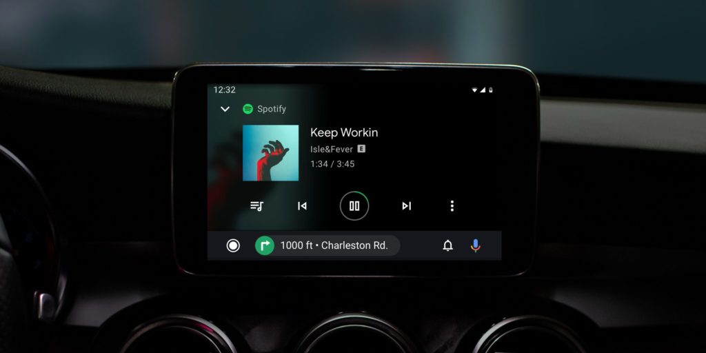
The company declared that they built the new interface to offer their users a faster platform, showing helpful information first, and make tasks easier to accomplish while driving. Previous versions had a system bar at the bottom of the screen showing five apps: Maps, Home, Music, and Car. The update will remove these from there and add them in a mini app bar, designed to simplify the experience. Apps will be displayed in a grid, and notifications will be shown when tapping a bell button.
The theme of the app will also be different. Android Auto will receive a darker color scheme.
Even more, Google said that the app will now start automatically playing media when you start up the car, launching your preferred navigation app at the same time.
Android Auto’s upgrades have been few and far between in the past. Google explained that in order to launch a new code for car systems, they need to go through several legal procedures before they are allowed to release updates.
The Android Auto app requires a tethered Android phone and a compatible car to function. To back up the announcement, Google publicly shared these images, showing off the new look of Android Auto.
As a passionate gamer since the 1990s, Vadim has kept his passion alive since then, and he is here to cover video games news, as well as to share with you all the novelties out there regarding gadgets or games-related tech.
