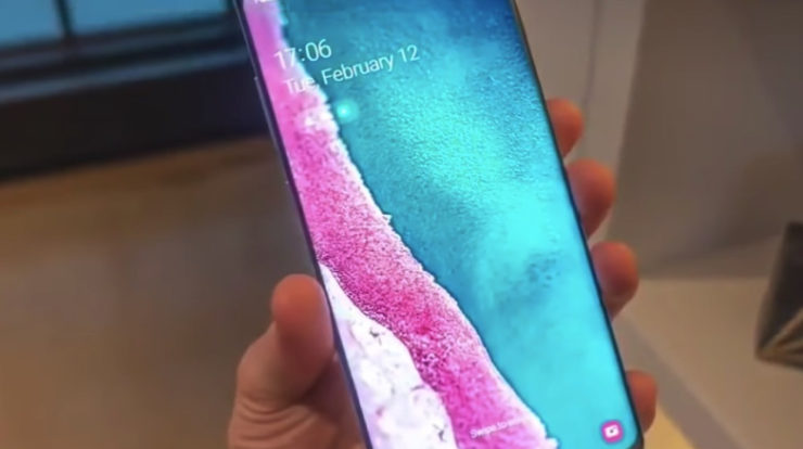
A makeover
When the Android Pie update has been announced by Samsung at the developer conference of the company in November, we could have guessed that something special will happen. The Galaxy UI was rethought and refined thanks to Samsung’s great effort. This device is also known as the Samsung Experience.
One thing is obvious, and that is that there are new fonts and app icons, but the visual changes are way more impressive. According to Samsung, when they created One UI, they wanted to keep its software and hardware in perfect harmony.
Functionality has been rethought
When it comes to apps, two new areas of interaction are introduced by One UI, control and content. Even though the philosophy is not that complicated, it is great because accessing content with one hand will be easier without needing to access a shrunken mode. With that being said, interactions become more enjoyable and faster.
When a Galaxy app is launched, you will find lower on the screen the content you need including contextual menus or recent messages, which means they are at both thumb and eye level. Once you start scrolling and taping, the screen is filled as usual, but more emphasis is put by One UI on the first tap.
Using your phone at night
The Night Mode has become the piece de resistance of the One UI, and you will see why for yourself. This feature has been waited for too long from Android so now, Samsung’s One UI offers it in a fully baked version. Even a button to toggle it on will be found in the quick settings menu. The OLED screens are fully taken advantage of by the Night Mode in One UI, as the notification panel will be painted with a deep-black brush which is gorgeous and will change the appearance of the whole system.
As a passionate gamer since the 1990s, Vadim has kept his passion alive since then, and he is here to cover video games news, as well as to share with you all the novelties out there regarding gadgets or games-related tech.


